IBM Carbon icon design - AI on Z Case Study
Context:
AI on Z is a suite of products that was moving toward GA but lacked an icon to use across UI, documentation and marketing
Problem
With the large set of products, there is a challenge of creating an icon that highlights the AI element and the open-source products.
Research Plan
Timeline:
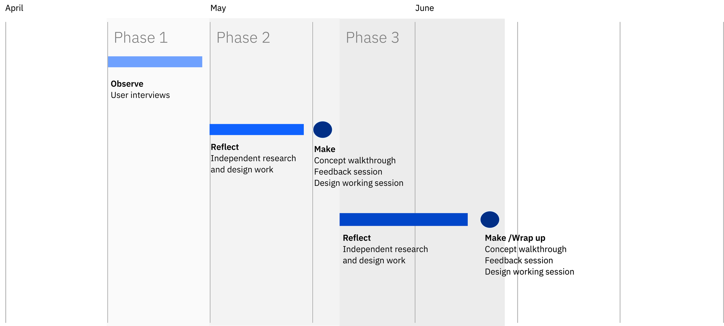
Phase 1


Areas of focus:
- What is the product
- What is the value to the customers
- What are the visual icons that have been used up to this point
I used this period as a time to have open ended discussions with subject matter experts on the AI on Z team to learn more about the AI on Z product bundle.
Learnings:
AI on Z enables the use of open-source tooling to work alongside each other.

The ecosystem of products includes several related but different products within IBM.

Intended customers have concerns about leveraging their current infrastructure investment with this suite of products.

The key value for customers is the use of machine learning to convert data from every transaction into real-time insights on their Z systems.

Phase 2


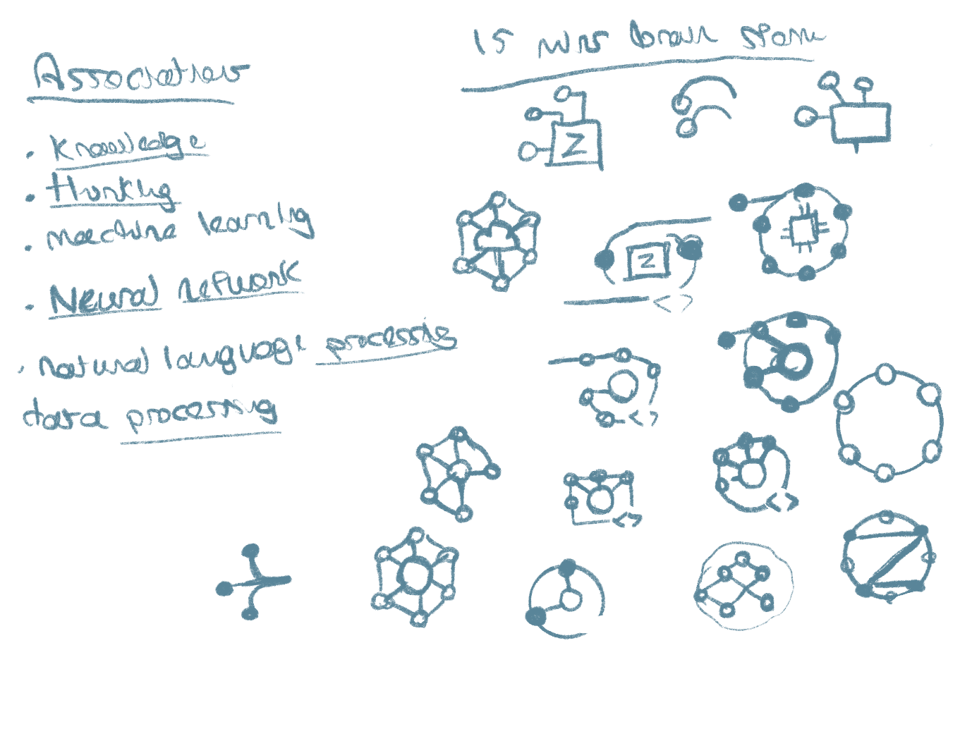
Initial Sketches
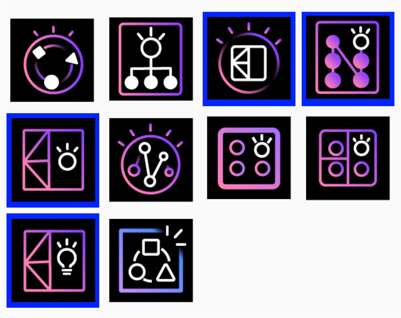
Round 1 of High Fidelity iterations

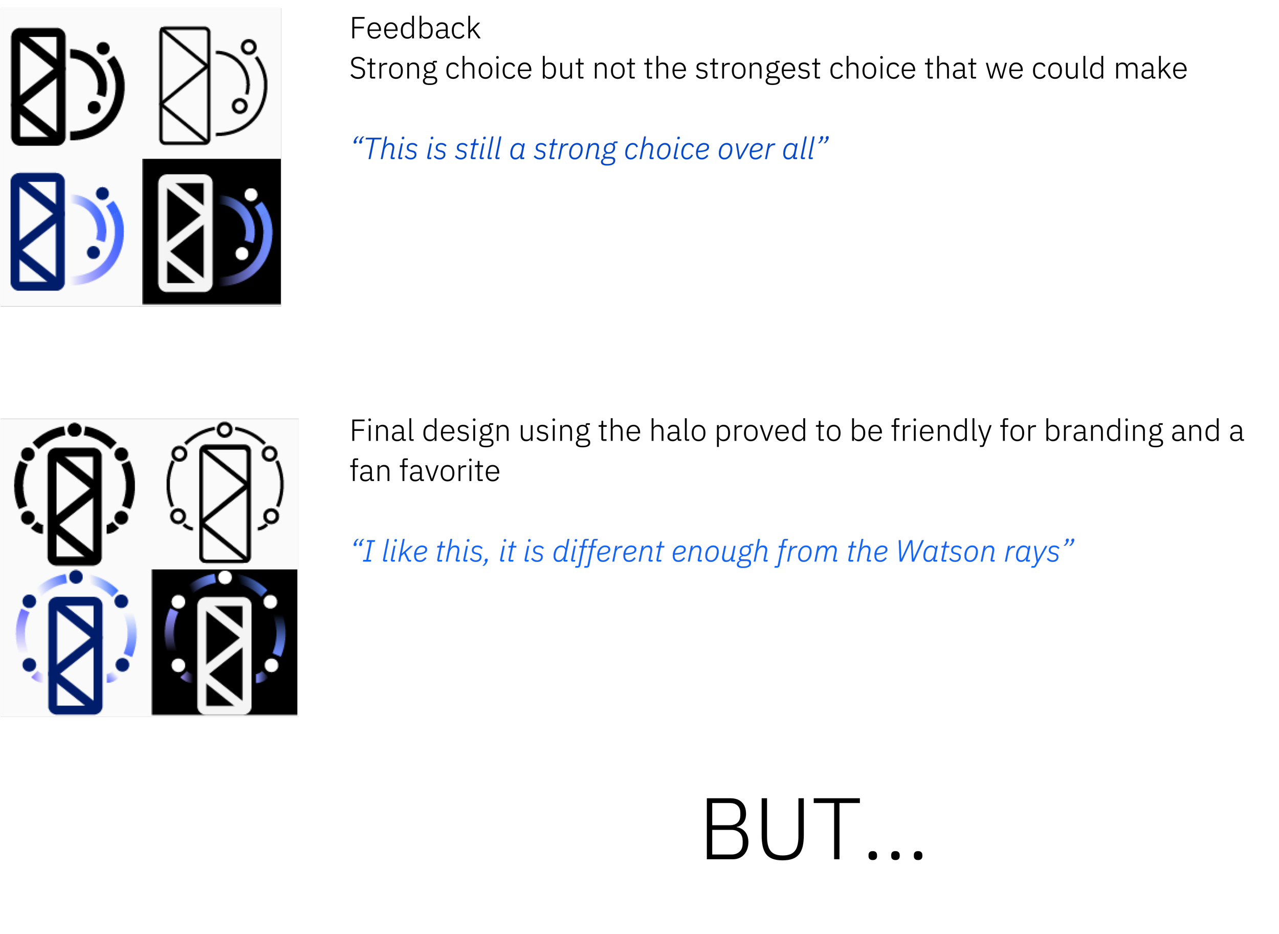
Original Watson icon design with radial halo

My design reuse of this radial halo design that needed to be validated with branding before use
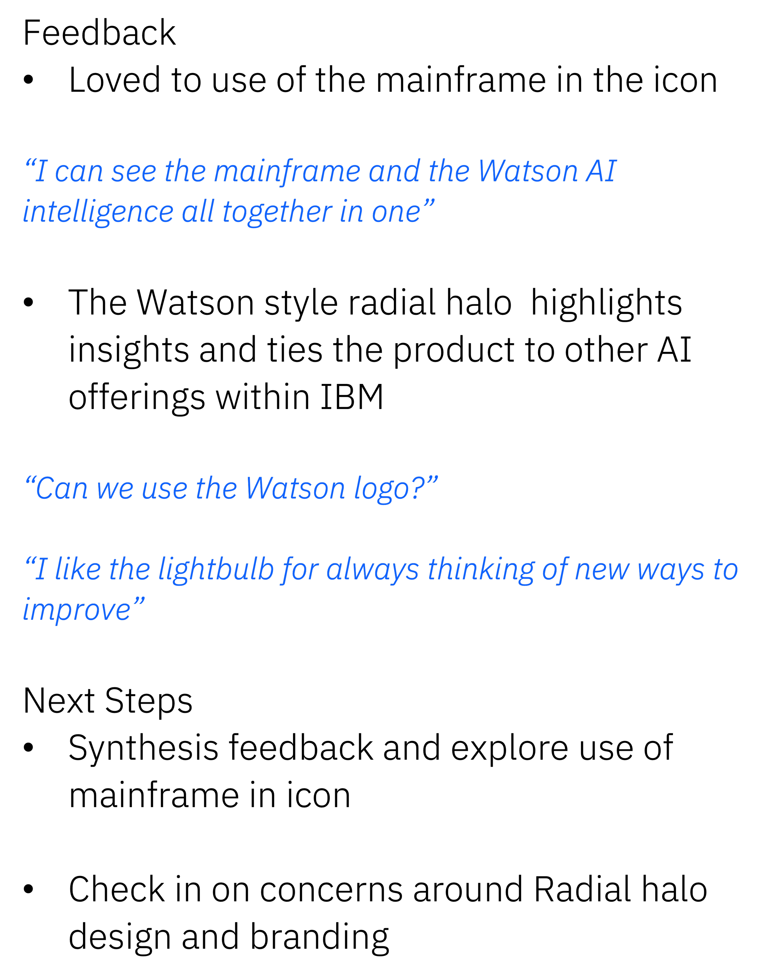
Round 2 feedback

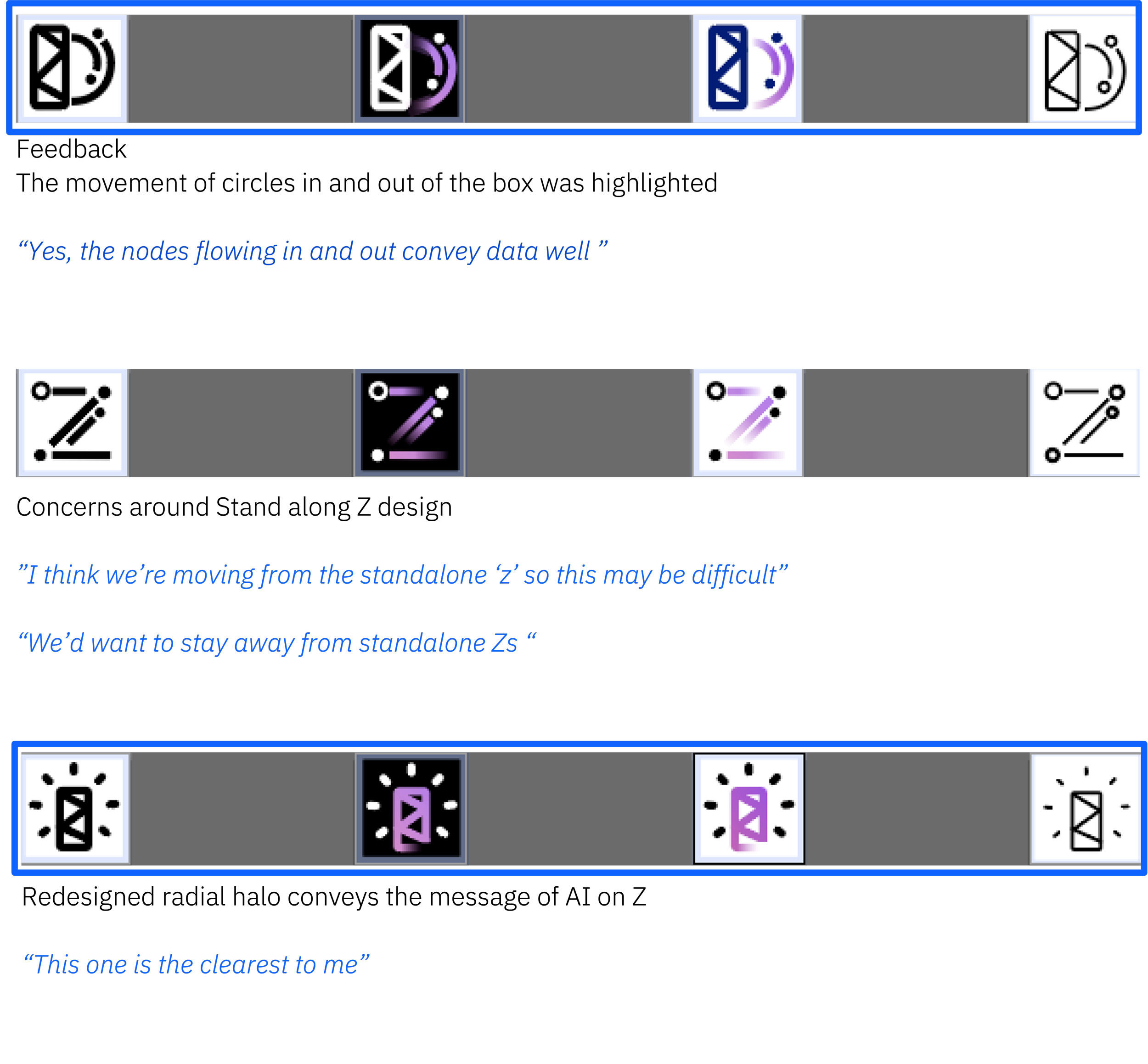
From this round, we aligned on the two designs outlined in blue as those incorporated the feedback for using the mainframe and elements of the radial halo effect.